Statistics
The statistics page can show you your results in a graphic way, which can be helpful when explaining results to colleagues or clients. Throughout the statistics results, the impact category can be changed, so its shows you directly the results of other impact results.
Environmental Cost Indicator (ECI)
The environmental impacts that occur along the supply chain vary inherently. Hence these impacts are categorized in impact categories (e.g. climate change, ecotoxicity). In order to arrive at a single indicator, weighing and merging of the scores is necessary. This is done in the form of the Environmental Cost Indicator (MKI in Dutch).
The impact categories are ordered based on characterization factors. Characterization factors are numbers that indicate how much a specific substance (e.g. 1 kg of CO2) contributes to an environmental effect (e.g. climate change). Since more greenhouse gasses contribute to climate change, the mutual relationship between these substances has to be determined. After characterization, an environmental analysis provides a score on various environmental themes such as climate change, acidification, eutrophication, etc. In order to bring down the scores on these themes to one number one can use weighing. Weighing reflects the relative importance of the environmental themes and is based on shadow price method. The shadow price is the highest cost level acceptable for governments (prevention costs) per unit of emission control.
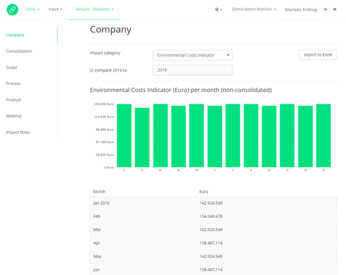
Company
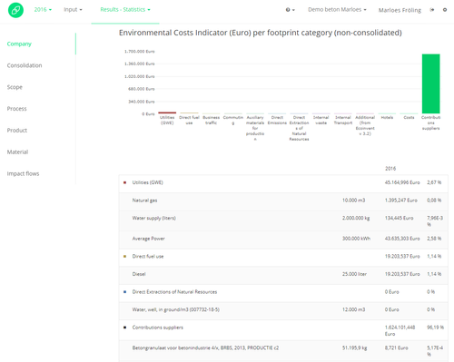
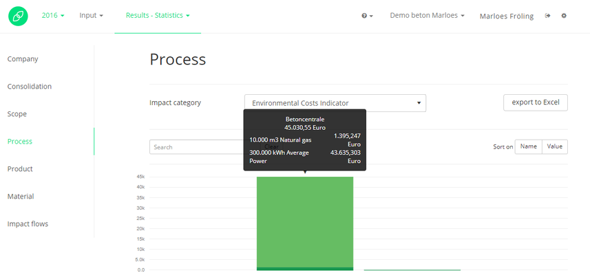
Process
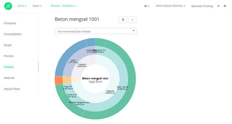
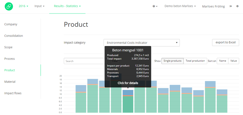
Product
Here all the inserted products in your account will be shown in a bar chart. The three colors used in this graph are blue for transport, green for materials and orange for proces impact. You can led the graph show you the single product results or the total production result. This last one is especially handy when you want to include the whole production, and not only per product. For example when a product with a high impact is only produced a few times, the total production impact can show you which products to focus on for improvement. Maybe this is a product that has a lower singel impact, but many are produced which results in a high total production impact. The bars can also be sorted by name or by value.
The product results can also be shown in a 'donut graph' as shown below. You can get this graph by clicking on one of the bars in the previous image, that shows your product results. The graph will be displayed below the product results.